OCTOBER 12, 2025
Stop adding confetti to your product
We talk about “delight” a lot in product meetings, but most of the time, it means adding confetti, sounds, or small animations.

Sooo you’ve probably been there.
You’re in a product meeting and someone says:
we just need to make it a bit more delightful.
Usually that means flashier visuals, extra motion, or a bit of haptic feedback.
But real delight isn’t decoration. It’s what happens when a product anticipates, simplifies, and surprises, all at the right moment.
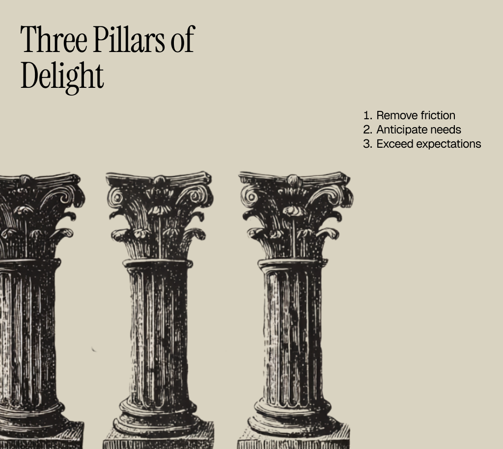
The Pillars of Delight
Delight has a pattern.
Nesrine Changuel breaks it down into three pillars: Exceed expectations, Anticipate needs, and Remove friction.
1. Remove friction
Sometimes delight isn’t visible at all.
It’s what happens when frustration never gets the chance to show up.
Nesrine calls this the invisible layer of delight. The one you only notice when it’s missing.
Think about Uber refunding your canceled ride automatically, before you even tap “Support.”
Or Slack…
Early on, users would sometimes join a Huddle call without realizing they were already live. It created an awkward moment… silence, confusion, or a quick rush to mute.
A simple fix could’ve been functional: add a warning message, a beep, or a bold alert. That would’ve solved the problem, but it wouldn’t have felt like Slack.
Instead, they introduced a fade-in “elevator tone.”
A subtle, friendly cue that lets you know you’re in a call. Functional enough to prevent mistakes, yet soft enough to feel on-brand.
What could’ve been a moment of panic turned into a moment of charm.
It’s easy to obsess over adding polish but the best teams design to avoid pain first.
The absence of friction is often the strongest form of care.
2. Anticipate needs
True delight feels effortless. Because it happens before you even ask for it.
That’s what makes it powerful.
The product doesn’t just react — it notices.
Revolut has eSims which they offer the moment you land abroad.
The right product, at the right moment.
Now imagine if either of those features appeared out of context a coupon code pop-up in the middle of a form, or an eSIM offer when you’re just sending money to a friend.
Same feature, completely different feeling.
Delight isn’t just what you show, it’s also when you show it. Context matters.
3. Exceed expectations
Delight happens when something gives you more than what you asked for.
Not a lot, just enough to make you pause for a second and think, “oh, that’s nice.”
When I was in Greece, I noticed this in the most unexpected place.. restaurants.
After every meal, usually a table full of shared plates, they’d surprise you with a free round of Ouzo shots or a small homemade dessert (Okay, now I'm craving Greek food).
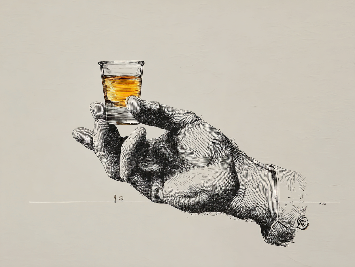
They didn’t need to. It wasn’t on the menu. But that small, thoughtful gesture changed how you remembered the place.
It wasn’t about the money, it was about the care.
Here is a product example.
Think about Microsoft Edge. I don’t personally use it, but… Edge automatically suggests a discount code right before you're about to checkout (something like Honey, without the scam bit).
You didn’t plan for it. You didn’t expect it.
But suddenly, the product feels like it’s on your side.
Why some designs feel... right
Take a look at the two shapes below.
One is soft and round. The other is sharp and jagged.
Take a second… which one feels like it should be called Bouba and which one feels like Kiki?
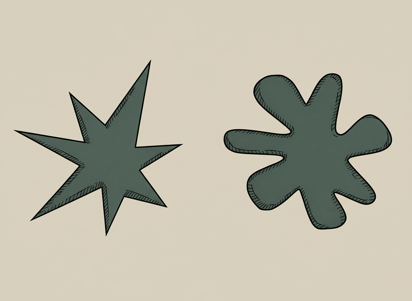
If you guessed the round one was Bouba and the sharp one was Kiki, you’re right.
That instinct is known as the Bouba–Kiki effect.
It shows how our brains naturally connect shapes, sounds, and emotions. Even when there’s no logical reason to.
Products work the same way.
Every curve, tone, word, and transition tells users how to feel.
A rounded button, soft motion, or warm tone signals comfort and care.
Sharp corners or cold copy make things feel distant or mechanical.
Delight lives in those subconscious details, the ones that make a product feel alive and human.
The best products don’t just function well.
They resonate.
They make people feel something, even if they can’t explain why.
That’s the psychology of delight, the space where design meets emotion.
The Anatomy of Delight
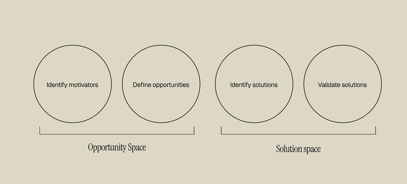
Designing for delight isn’t about guessing what will make people smile. It’s about uncovering what motivates them, turning that into opportunity, and validating it through experience.
Nesrine’s Delight Model is a great way to think about that journey.
It breaks down how to move from understanding people to designing solutions that actually resonate.
Identify motivators
Why are people here? What emotion or intent? drives them?
What are they feeling before they even open? your app?
Define opportunities
Where can you make things easier, clearer, or more meaningful?
What expectations can you quietly exceed?
What moments feel flat or transactional that could feel human instead?
Identify solutions
How might we turn those opportunities into product ideas?
What could we automate, simplify, or surprise with?
Which features could connect emotion with function?
Validate solutions
Does it actually delight?
Do people feel something when they use it?
Does it build trust, reduce friction, or make them smile?
A strong roadmap balances all three.
You need the foundation (50%), the empathy layer (40%), and the personality (10%).
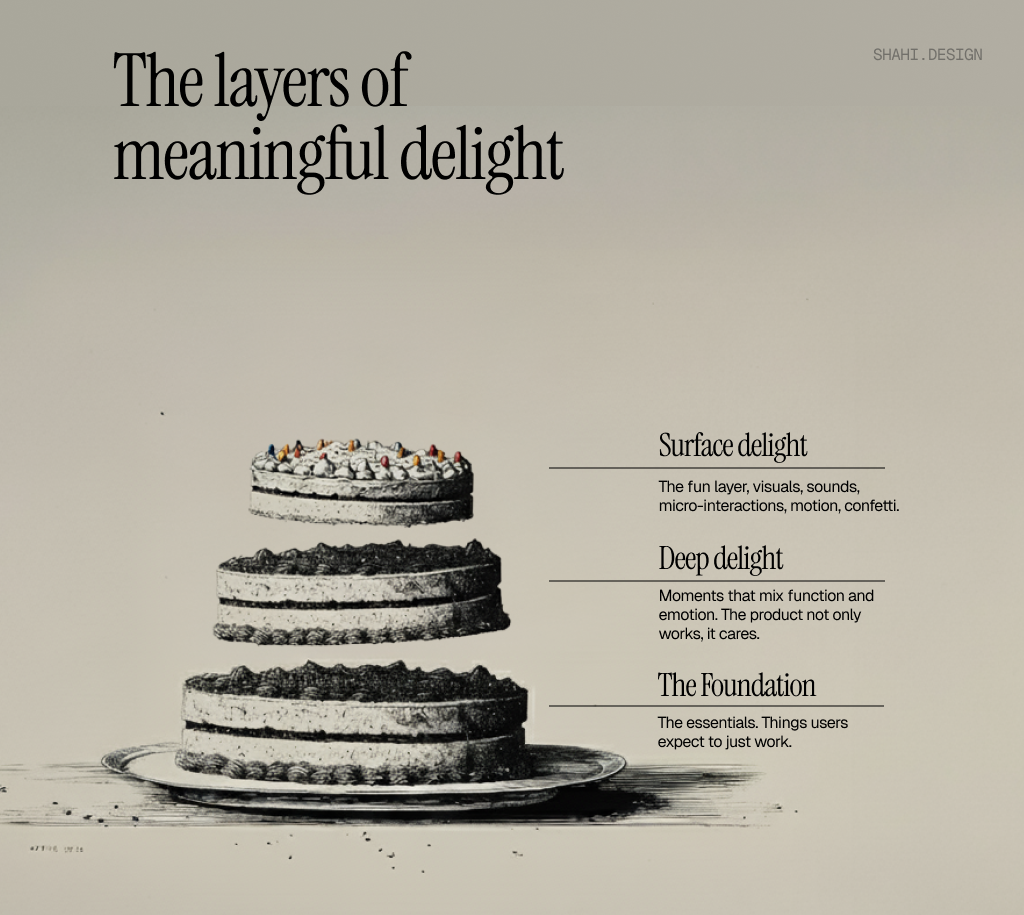
50% — Foundation
This is the base layer. The product is reliable, fast, clear, and consistent.
If this part fails, nothing else matters.
Delight doesn’t stick when users are frustrated.
40% — Deep delight
This is where empathy lives.
Moments that connect function and emotion, when a product not only works, but cares.
It’s Google Maps automatically adjusting your route when you miss a turn saving you from frustration before you even feel it.
It’s design that anticipates, simplifies, and reassures.
10% — Surface delight
This is the fun stuff, animations, sounds, microinteractions, confetti.
It adds warmth and personality, but it only works because the layers below are strong.
Think Duolingo’s bird cheering you on, or celebrating your streak with confetti.
Most teams start at the top.
They try to sprinkle delight at the end.
But the truth is, delight only scales when it’s baked into the foundation.
Season your product like a chef
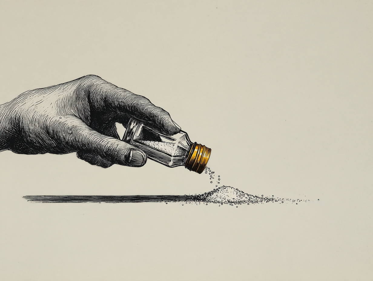
A good chef doesn’t just add salt at the end of their cooking.
They season throughout the process — tasting, layering, and adjusting as they go.
Delight works the same way.
It can’t and shouldn’t be something you add at the end of the journey a bit of haptic feedback here, a confetti animation there.
Those things might add a spark, but they don’t build depth.
Like seasoning, delight should deepen the core product.
It should be felt in the flow, not just seen on the surface.
Apple is a masterclass in this.
Delight isn’t something they tack on after the product ships — it’s baked in from the very beginning. From the reveal in their keynote, to the packaging, to the onboarding flow.
Nothing feels isolated. It’s all part of one emotion.
That’s what real delight looks like: consistency.
The promise you make in marketing is the same one you deliver in product. The copy on your site, the tone in your notifications, the feel of your emails it all speaks the same language. And when that experience stays consistent, users don’t just use your product — they trust it.
Because delight isn’t a moment. It’s momentum. It’s what happens when a company treats every interaction, from the first ad to the last email when you unsubscribe, as part of one continuous story.
Delight as a Growth Lever
As a growth product designer, I work somewhere between data and emotion... helping people find value faster, but also feel something along the way.
And that’s where delight becomes a real growth lever.
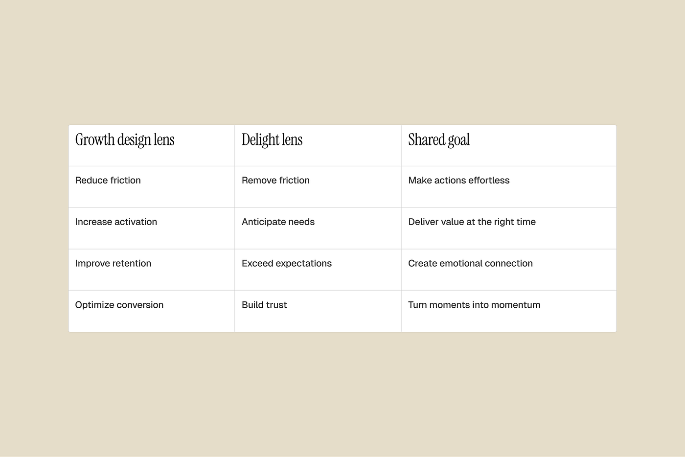
Delight and growth might sound like two different goals. One emotional, the other measurable, but they’re deeply connected.
Delight, when done right, is a growth engine disguised as care.
It drives user behavior through emotion: satisfaction, trust, curiosity, joy. Here’s how the two overlap:
I saw this connection firsthand when we were testing rewards at Bumble. Our goal was to reward a segment of our members with access to a feature to drive engagement.
On paper, it was a win-win. Something relevant, valuable, and completely free for our members.
But when we launched it, it failed.
Even though the feature was a gift, members were closing the bottom sheets almost instantly.
When we dug deeper, we realized it wasn’t about the offer — it was about the timing and how we showed the reward.
They’d seen so many bottom sheets and promos trying to sell them something that the reward one no longer stood out.
They had developed banner blindness.
So to make it truly delightful, we had to break that pattern.
We changed the design, copy, added animations, slowed down the interaction, and made it feel like a moment — not a promo.
Something that stood out from the usual noise.
And it worked.
Members finally noticed it, accepted it, and started engaging with the feature.
That’s what delight in growth design can look like. Not adding sparkle, but adjusting timing, emotion, and context until something feels right.
Cool, but how do we measure success?
The tricky thing about delight is that you can’t measure it the same way you measure clicks or revenue. It’s not always visible in dashboards, but it shows up everywhere else.
When I think about measuring delight, I see it through three lenses: emotion, behaviour, and balance.
1. Emotion — do people feel something?
Look for signals in what people say and remember.
If users mention a moment unprompted, or describe an experience with emotion — that’s data too.
You can see it in reviews, support messages, or the way people talk about the product online.
Delight leaves a trace in language.
2. Behaviour — do people act differently?
Delight often changes what people do, not just what they say.
You’ll see it in higher retention, repeat actions, and referrals.
You can also track smaller signals:
Do people repeat optional actions?
Do they complete flows more often?
Do they share screenshots or tell others?
3. Balance — are we investing in the right layers?
This is where the 50/40/10 rule and the Kano Model come in. Not every feature should delight. Some should just work. The goal isn’t to maximize delight everywhere, it’s to create contrast:
a solid 50% foundation, 40% empathy, and 10% magic.
If everything tries to be delightful, nothing stands out. If everything is purely functional, nothing connects.
A good product balances both the reliable and the remarkable